
A Renaissance-Inspired Full Sleeve: A Personal Story in Black & Grey Realism
Introduction — A Sleeve Built From Real Meaning
Every client brings something different through the studio door.
Some want a theme.
Some want a character.
Some want a style.
And then there are clients who come with a set of personal elements that don’t obviously fit together at first glance, but each one holds a story.
This sleeve was exactly that.
He didn’t ask for a unified Renaissance concept.
He didn’t ask for a mythological sleeve.
He brought pieces connected to his family, his memories, and the art he grew up around. A Virgin Mary holding Jesus. Peaches that reminded him of his sister. A rose. Renaissance-style sketch-work. A painting by Roberto Ferri. Atlas. A rose window.
Different ideas, different eras, different moods — but all important to him.
My job was to structure these pieces in a way that made sense visually and emotionally, without losing the individuality of each element. The challenge wasn’t which images to use, but how to make them live together on one arm.
This blog is the process behind that.
The Consultation — Understanding What Each Element Meant
Before any sketching or planning, we sat down and talked through each idea.
The Virgin Mary wasn’t just a religious reference — it was chosen because his mother loved Renaissance paintings. He grew up seeing that kind of artwork, so it became a natural part of the sleeve.
The peaches were something completely different — a small tribute to his sister. They didn’t need to be realistic or bold. They just needed to be part of the story in a subtle way.
The rose was a personal symbol.
Atlas was something he felt connected to visually.
The Ferri’s painting was simply a piece of art he loved.
The rose window added a structural, architectural finish.
Once I understood the meaning behind everything, the next step was figuring out placement and order. When a sleeve has one theme, placement comes easily. But when the themes vary, placement becomes the real craft.
I suggested starting on the inner forearm with Atlas, then building upward into the Renaissance pieces, and finishing with the rose window on the outer arm. It created a clear direction for the flow.
He agreed, and we began.
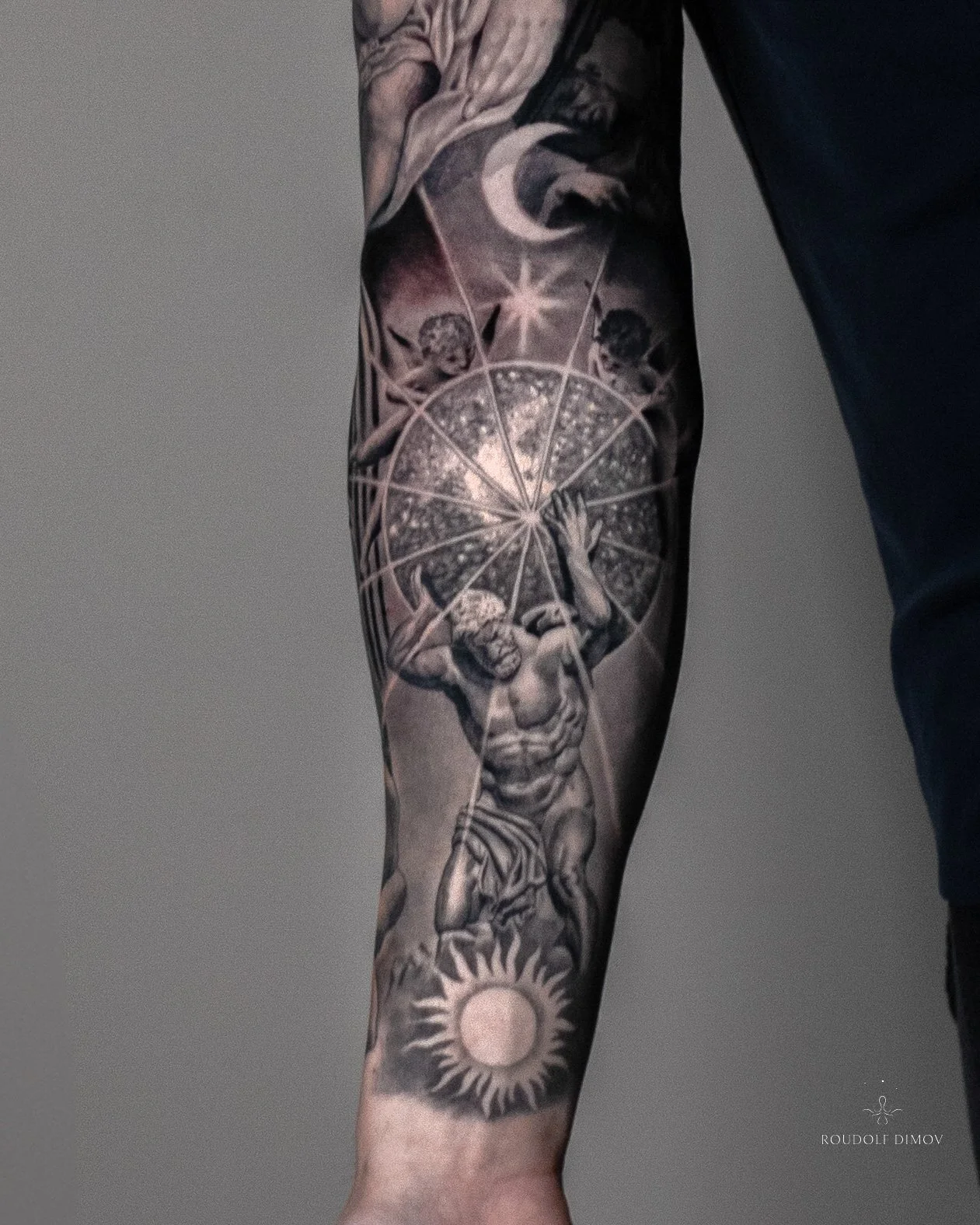
Starting Point — Atlas on the Inner Forearm
The forearm is usually where the sleeve sets its pace, so we chose to start with Atlas.
Not for dramatic symbolism — simply because it was a strong visual anchor that matched the tone he wanted.
Atlas is often shown holding the sky, not the world, so I designed a celestial sphere to represent that. It also blended in well with the architectural and Renaissance elements we added later.
At the bottom of the forearm, I added a sun.
Above the sphere, a moon.
Not as metaphors — just practical design elements that balanced the space and created a smooth vertical transition.
Atlas became the base of everything that followed.
Transitioning Toward the Upper Arm
Transitions matter a lot in sleeves with mixed themes.
You can’t have one area end abruptly and another begin without thought — otherwise the sleeve looks fragmented.
Between Atlas and the Renaissance section, I softened the transitions with gradual shading. Enough texture to connect the areas, but not enough to distract from the main pieces.
This was the moment the sleeve started to feel unified.
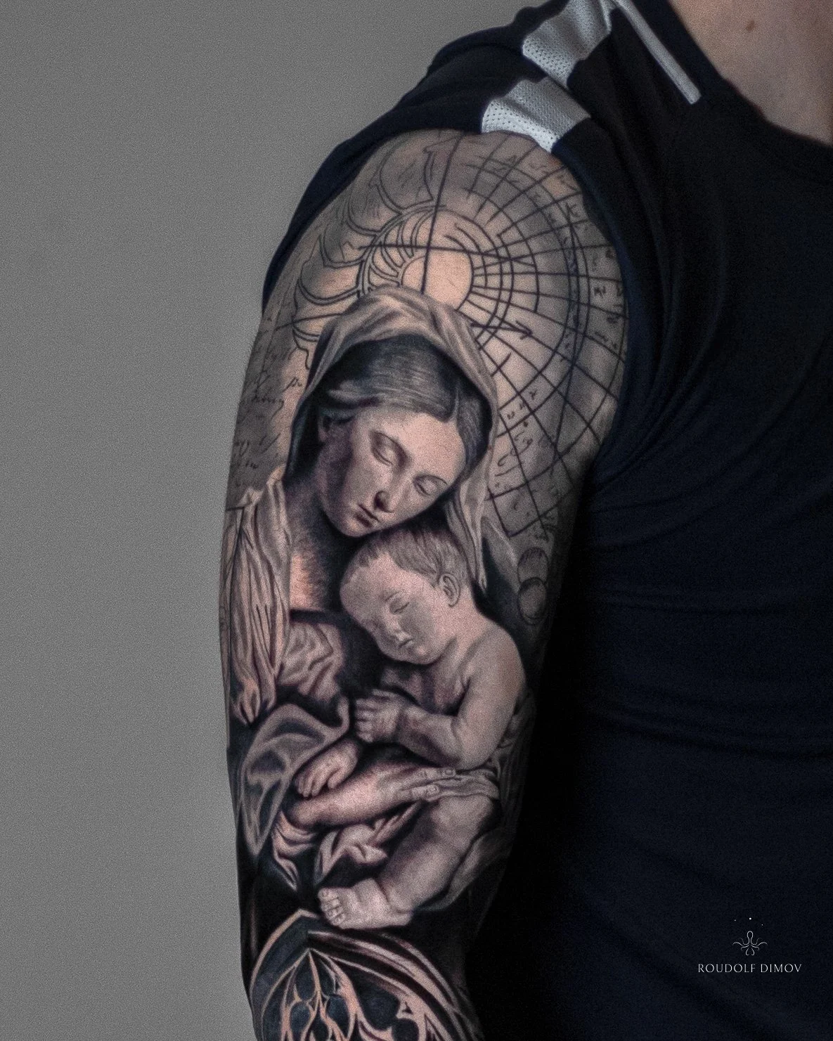
Upper Arm — Renaissance Influence and Personal Memory
The upper arm carries the most detailed part of the sleeve:
a realistic Virgin Mary holding baby Jesus.
This piece stays close to classic Renaissance artwork — soft light, clean shading, calm facial expression, and an overall sense of stillness. It was important not to exaggerate anything. The goal was to respect the style he grew up around without turning it into something overly dramatic.
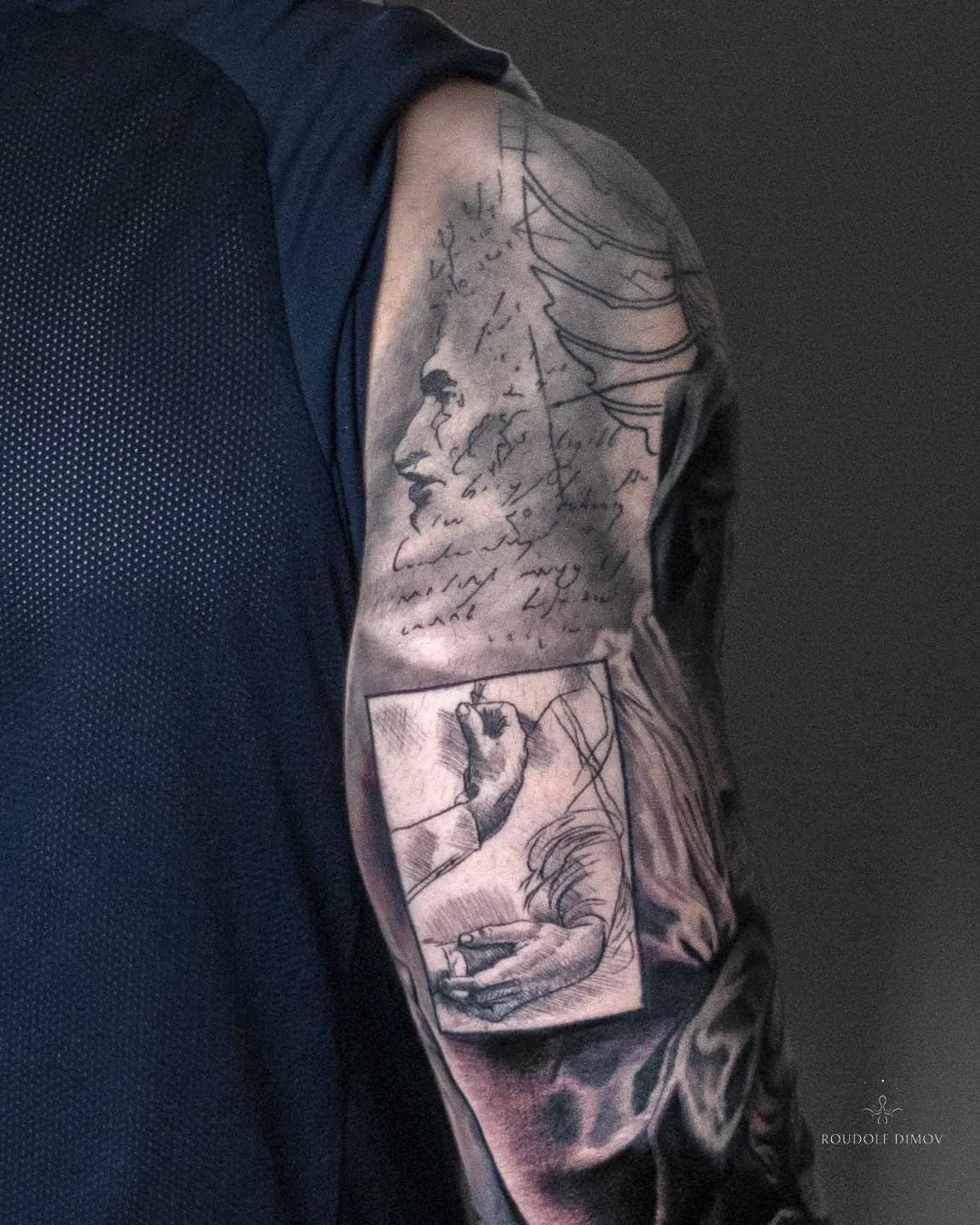
Around the Virgin Mary, on the triceps and shoulder area, I added Da Vinci-inspired sketch-work. These sketches include handwritten-style notes, light architectural lines, and simple shapes.
They do three things:
They place the sleeve visually in the Renaissance world.
They help transition between realism and the other themes.
They fill negative space without stealing attention.
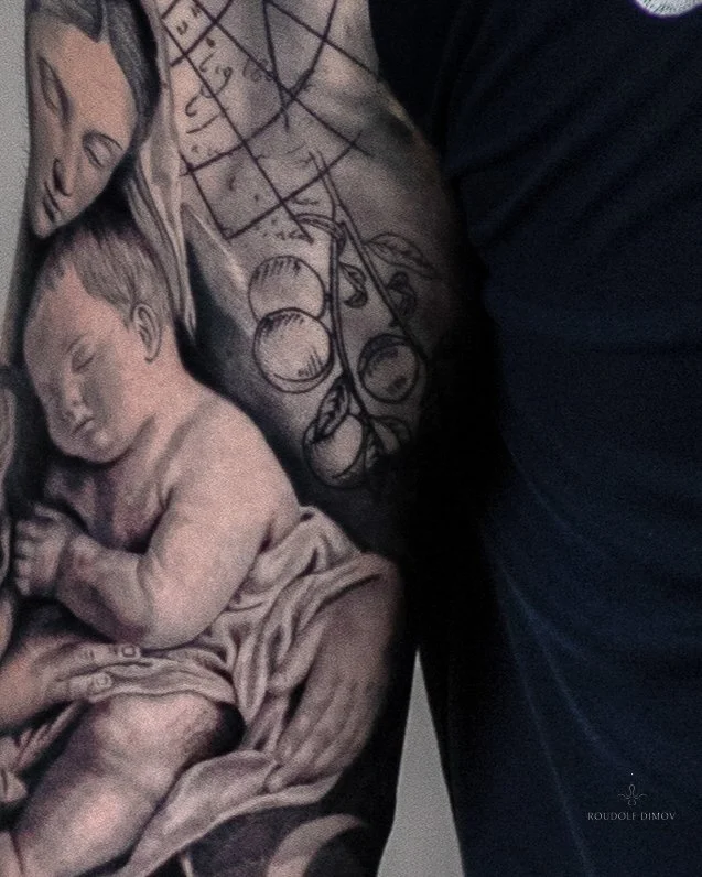
This is also where the peaches were placed.
Not realistic, not highlighted — just integrated into the sketch-work so they remain personal without interrupting the flow.
This part of the sleeve holds the emotional core, and the sketch-work helps keep the tone grounded and visually consistent.
Inner Bicep — The Roberto Ferri Painting
The inner bicep is a private area of the arm, seen only when the arm opens.
That made it a good place for the Roberto Ferri painting.
Ferri’s work mixes classical structure with contemporary intensity.
Anatomy, movement, stronger emotion — it’s different from the rest of the sleeve, but that contrast works well on the inner arm.
Placing it there allowed the piece to contribute to the overall sleeve without overpowering the upper-arm realism or the forearm composition.
It added depth, variety, and a different mood, while still respecting the flow.
Outer Arm — Rose Window and the Rose
The final major element of the sleeve sits on the outer arm:
a rose window combined with a realistic rose.
The rose window brings structure.
The rose brings softness.
Together, they balance the entire sleeve.
After the mythological foundation, the emotional portrait, and the contemporary painting, this final combination gives the sleeve a clear, stable ending.
It feels complete here — not crowded, not overstated.
Creating Flow — The Technical Approach Behind the Sleeve
When all elements share the same theme, flow is automatic.
When elements come from different worlds, flow becomes intentional.
With this sleeve, I had to pay attention to:
spacing
direction of shadows
depth and contrast
placement of dark and light areas
how each element leads the eye to the next
how the skin tone works as part of the composition
The Renaissance sketch-work became a very useful tool.
It helped soften transitions, create movement, and build a bridge between realism and symbolic elements.
The celestial sphere connected the forearm to the upper arm without forcing the styles together.
Ferri’s painting added movement that naturally led into the rose window.
Throughout the sleeve, I made sure no single area felt isolated.
Everything needed to contribute to the same visual story.
Why This Sleeve Stands Out for Me
Some sleeves challenge your creativity.
Some challenge your technique.
This one challenged structure — arranging different ideas into something coherent.
It pushed me to think differently about placement, transitions, and the relationship between styles.
It also reminded me why I enjoy creating custom sleeves:
You’re not just tattooing images.
You’re building something that fits a person’s life, not a trend.
Something they’ll carry for years.
Something that connects different parts of who they are.
This sleeve didn’t have a single theme — but it had a clear purpose.
And that’s what made it meaningful to create.
FAQ — Renaissance Sleeve Questions Clients Often Ask
1. How long did a sleeve like this take?
A sleeve with this amount of detail and variety usually takes 8–12 full-day sessions, depending on healing, detail, and complexity.
2. Do I need to bring all references before booking?
No. You can bring ideas or meanings, and we’ll build the references during consultation.
3. Can we mix different art styles in one sleeve?
Yes — if the composition is planned carefully. Good transitions and balanced placement make it work.
4. Which areas hurt the most?
Most clients say the inner bicep, elbow, and wrist are the most sensitive areas.
5. Does black & grey realism age well?
Very well. It relies on contrast rather than heavy colour saturation, making it one of the most durable styles.
6. What’s the aftercare process?
Keep it clean, avoid over-moisturising during the first days, and follow the instructions on my Aftercare page.
🔎 Explore More FAQs:
https://www.roudolfdimovart.com/faq
Thinking About Starting a Sleeve?
If you’re planning something personal, symbolic, or story-driven, the best place to start is a consultation. We can explore ideas, build a direction, and plan the full sleeve properly.
👉 Large Projects:
www.roudolfdimovart.com/large-projects
Bring your story. I’ll shape it into art.
👉 Book a Consultation:
https://www.roudolfdimovart.com/booking
📍 London
✉️ info@roudolfdimovart.com